This blog is brought to you by a special guest, Ana the Analyst.
As deposit deadlines approach and LOCIs begin to be drafted, many an applicant has but one thing on their minds: how much waitlist movement should we be expecting, really?
The short answer: we don’t know.
The long answer: this is a historic year of many changes, including: the onslaught of a global pandemic; an increase in seats taken by deferring students; a massive increase in applicants; a massive decrease in acceptances; and much, much more. Complicating matters is that schools have historically made access to information very limited.
Luckily for us, we have access to a website known as LawSchoolData, which tracks user inputs on school results, and provides an automatic way to check statuses. While this data is not *perfect* data (unfortunately, people on the internet lie; LawSchoolData pulls information from an older website, LawSchoolNumbers, causing certain users from both websites to be double counted in the data; less than 20% of T50 applicants have historically used the website; approximately 30% of those users don’t bother to input their data; the website disproportionately has high scorers compared to the applicants pool; and much more, which will be covered by a later post), it provides a summary of self-selecting user data, including previous waitlist and waitlist movement.
The analysis below includes waitlist information for the Top 50 schools for the last five cycles (for purposes of clarity, we did not use schools with less than 100 available data points for any year in the analysis period; accordingly, BYU, Utah, Arizona, Pepperdine, and Maryland are not included). In addition to the comments above, waitlist information can be particularly pernicious, as people can get off waitlists very last minute and not get around to updating their LawSchoolData profiles.
LSData Waitlist Movement for T50
So, without further ado, this is the historic LSData waitlist movement for the T50:
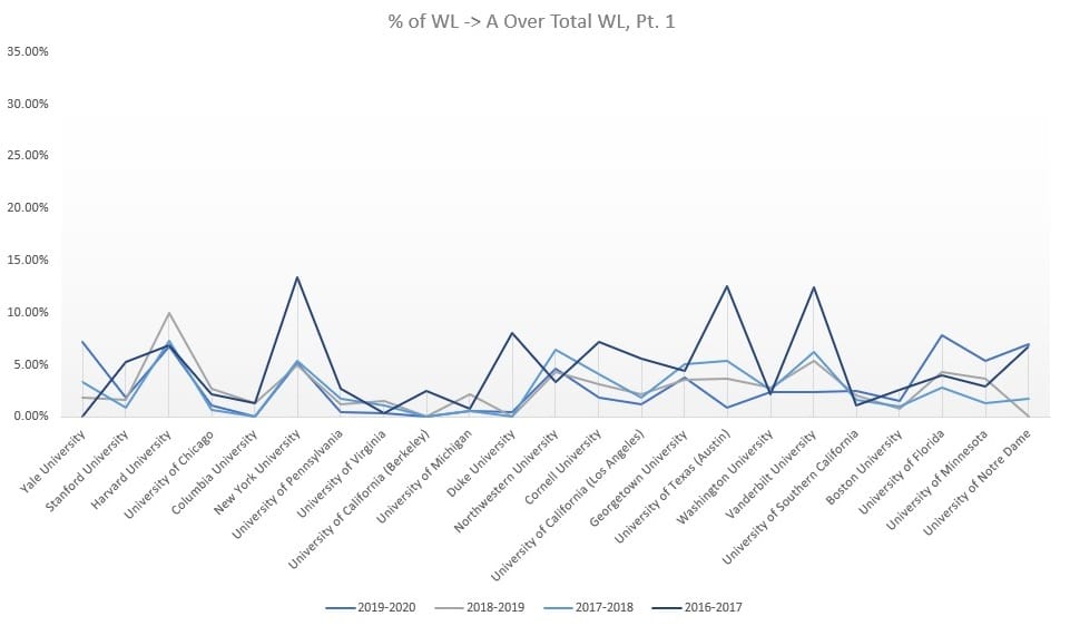
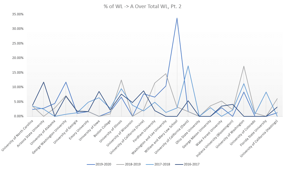
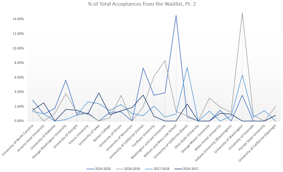
William & Mary had a particularly active year in 2017-2018 and the University of Washington had an active year in 2018-2019, but otherwise schools seem to be relatively consistent between years, with 2016-2017 being a more active year in the T20 across the board.
We’ve already started to see waitlist movement this year from a few schools, including GULC and UCLA. This is the first year where LSData has included an option to provide detail on which “flavor” of waitlist an applicant is put on, and it looks like GULC is pulling from the special preferred and the regular waitlist about evenly, with a slight disadvantage to the regular preferred waitlist. It also appears as though GULC’s two “preferred” waitlists are for those who interviewed, and the regular waitlist is for those who did not receive an interview invite.
In addition, Notre Dame inflicted a new form of waitlist—the waitlisting of admitted applicants who didn’t deposit quite fast enough—when they unexpectedly closed their deposits early. The early deposits were spurred by a clause in Notre Dame’s acceptances that closed their deposits on the earlier of (i) all seats taken or (ii) April 15. This could indicate a higher yield than normal, and lower waitlist movement.
% of Applicants Accepted from a Waitlist
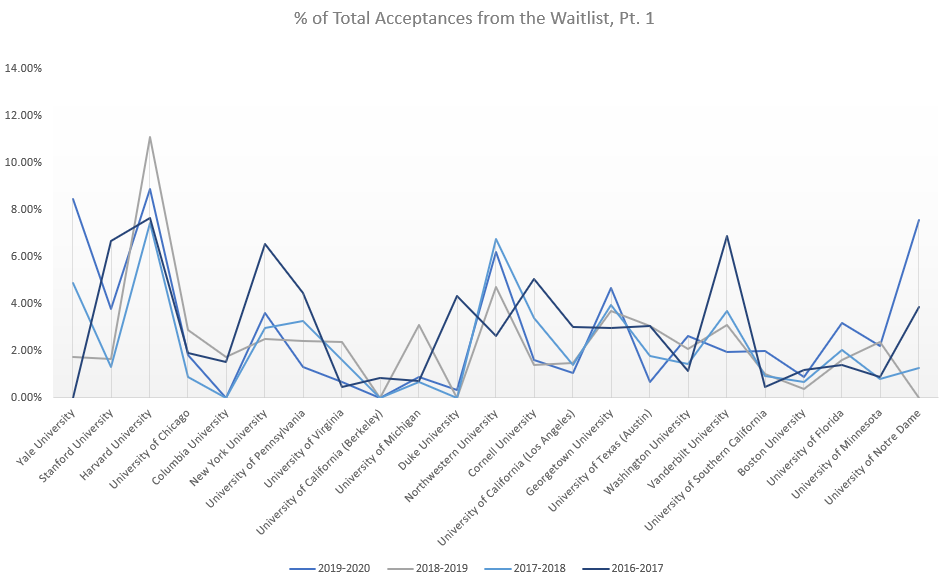
This is the percentage of total LSData acceptances that came from the waitlist in the T50:
Harvard pulls from the waitlist pretty consistently on a year by year basis.
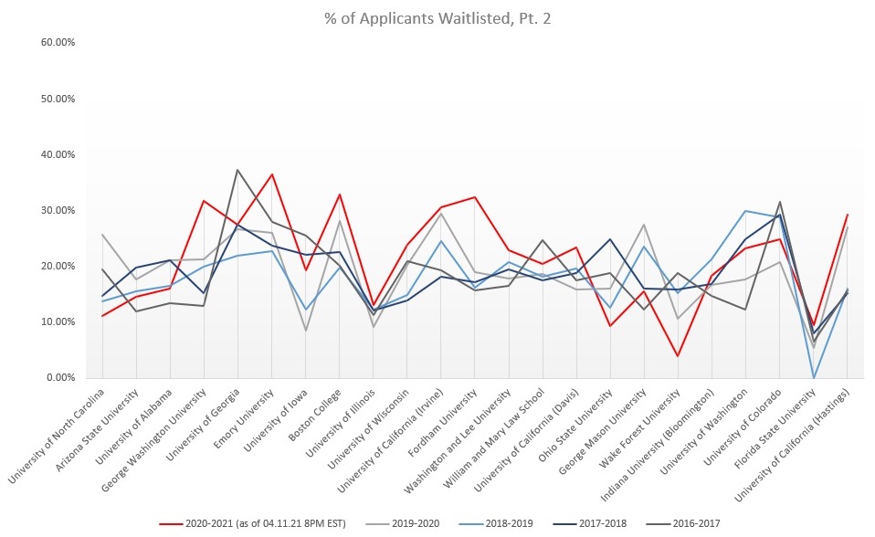
# of Applicants Waitlisted
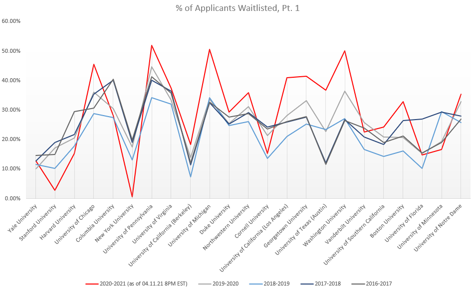
Unfortunately, it looks like schools are waitlisting a higher portion of students than normal this year (at the time of this analysis, April 11, 2021 at 8 PM EST, some schools have yet to release waitlist waves, a phenomenon commonly referred to as “ghosting”; however, there still is enough data to see a clear trend of waitlist increases):
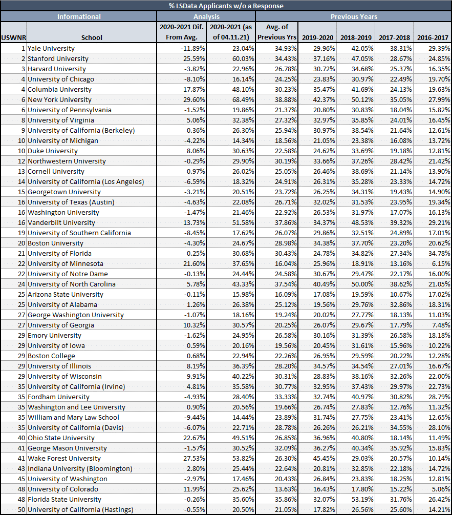
LS Data Applicants Without a Response
With many this year still waiting on an answer one way or another, another questions many applicants are asking themselves is whether or not the cycle is moving slower. This is where schools stand compared to historic percentages of LSData applicants who never got around to updating their status with a response:
Of these schools, some of the ones with a significant portion of answers outstanding (Columbia, Vandy, NYU) are known for having late waitlist waves. Essentially, it looks like we have a greater percentage of the applicant pool inputting a response than normal. This means the cycle is either moving *faster* than normal, or that we have an increase in the *true* usage of LSData (which is the more likely explanation of the two).
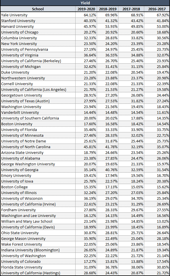
Yield
What is the primary mover of waitlists? Yield; yield is the percentage of students who are given an offer who accept a spot. Acceptances do not happen at a 1:1 ratio, even for HYS; as the Notre Dame situation showed us, schools admit more students than sports, and allow for yield to handle the rest.
There is a difference in yield from people who are given an offer off of the waitlist (much higher, on average, after writing LOCIs and demonstrating interest and responding to feelers…) and the yield from direct offers. An acceptance off the waitlist *does* tend to have a 1:1 ratio per spot available.
This is what yield has historically looked like for the T50:
The Notre Dame deposit situation and Dean Zearfoss of Michigan have indicated that yield may have increased this year. In addition, the decrease in yield at HYS and other schools may indicate prior year admittances who deferred their start to the Fall of 2021 instead of joining last year’s class. This means that seats that would normally be available for a specific cycle’s applicants could already be filled with deferrals. Less acceptances would then be needed to fill the lower number of seats available.
Less acceptances available per applicant may mean less chance for an applicant to pick a different school, increasing yield again. As waitlist movement tends to have “trickle down” effects (i.e., Harvard pulls an applicant off the waitlist who had committed to Northwestern; Northwestern now has a spot available in its class, so it pulls an applicant off the waitlist who had committed to WUSTL; and so on), the waitlist movement may be particularly slow this cycle.
Final Note
This year is anomalous in a number of ways, which means historical data may only go so far. The historical data we have is limited, but it does tell us which schools tend to have active waitlist movement and which schools waitlist as a soft rejection. We could have a very active waitlist summer; we could have an overwhelming increase in yield, and everyone is frozen in place.
What does that mean for applicants riding out waitlists right now? For those of you that are fortunate enough to have received a few acceptances this year, love the one that you are with (a bird in the hand is worth two in the bush and all that jazz) and congratulations on the next step to becoming a lawyer!
For those considering retaking and reapplying: the June Flex sign-ups are open until April 30, before we switch to a new, four-section test in August.


Howard Kier says
Can this blog post be update with the data from the current admissions cycle?
PowerScore Test Prep says
Hi Howard!
Thanks for the post! We’re still in the process of tracking details through yet another unpredictable cycle, and we will wait to update until we have a clearer sense of how this year fully plays out. The last thing we want to do is publish an update prematurely that could mislead people. 🙂
Thanks!
Melissa Hall says
You posted the same graph twice on accident for % accepted off wait list – can you please update the Pt. 1 version to the Pt. 1 schools?
Dave Killoran says
Hey Melissa,
I’ll have them check this out and fix it, thanks for the heads-up!
Thanks!